

Intro into Starting a Brand
It’s imperative that a brand/business has good branding and identity. So we decided to take a look at Emily Hicks’ Branding and Identity Workshop to get some tips and tricks for this blog, on how best to start branding your new business! 🙌
1. Where should you start?
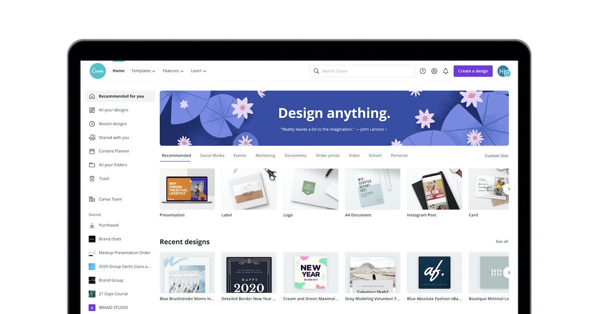
Firstly, Emily says you should start by getting a logo for your Brand/Business. Create one yourself if you know how to or pay a graphic designer to create one for you. You can use logo templates if you’re just starting out on Apps like Canva and Wix, these are great if you don’t have the budget to pay a designer for a logo! As you can see in the image below, you can design anything you like using Canva.
If you do have the budget though, paying a designer is the best option in the long run because you can guarantee that your logo will be more unique.
Secondly, bullet point your brand values services and selling points. This is important because you need to know what your brand is, what it’s about, and what it does. People will ask you what your business is, so if you have your brand values and services perfected you will know exactly what to say when asked.
Thirdly, get your social media up and running ASAP! Even if you don’t intend to use the social media platforms straight away, it’s important to get your accounts set up so you can secure your handle with your brand name.
2. What makes a good brand?
What will make your brand a ‘good brand’ and make it stand out?
Emily suggests showing who your company is and why you’re different to the competition. You want to show that you’re not just the same as any other brand or business out there that is selling the same services or products that you are. Have a distinctive brand personality that is appropriate for your target audience, this will draw that audience into your brand and make you stand out from the crowd.
Always be consistent in your messaging and design, this will make you easier to remember and stick in peoples mind because they will know exactly who you are. This will also increase the value of your work!
Simplicity in your design and branding is important and will help your brand stand out. Why?
Customers need to know the most important points of a product/service, they don’t need to know every detail. Anything complicated will turn the customer off, people like ‘what you see is what you get’ and this essentially will help you draw customers eyes to your products/services. For example:
![]()


As you can see the Apple logo and branding is the epitome of simple and straight to the point. They show you the important stuff that you need to know as a customer/consumer, and we all know that this works well and sells. The white space, the simple design, and as little text as possible is pleasing to the eye.
Instead of branding like in the third image underneath the Apple billboard, it’s all over the place with unusual graphics, colour, and different fonts, it has too much going on and will turn people off. So always remember that simplicity is key for a good brand.
3. The importance in colour branding
Huge brands and businesses use specific colours in their branding for a reason. Colour psychology affects our lives every day and we don’t even realise it. There has been studies to show what colour does to us and our brains subconsciously, so it’s something to think about when deciding what colours you want to use for your brand/business.

We all know and remember the McDonalds logo and the golden arches. There’s a reason why McDonalds chose the colours red and yellow for these golden arches and the rest of their branding. Red is used because it’s a bright colour and is proven to always capture our attention, and Yellow is used because it’s a colour that is proven to increase our appetite! So, it’s really important to think about colour psychology for your business’ branding.
Emily gave us some information in her workshop about colours and their associations, and how colours can affects us which you can see below 👇
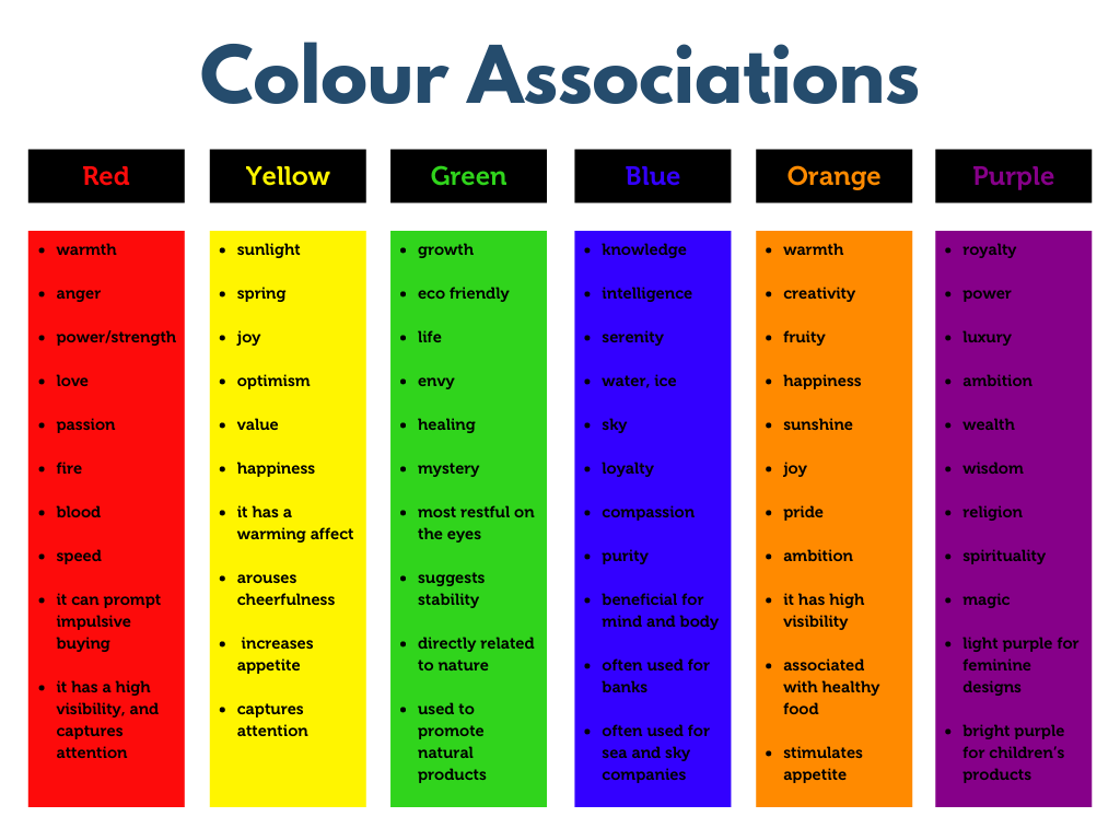
For more information on colour psychology click here✨
4. Once you’ve got your brand, it’s important to stick to it
It’s important to stick to your brand because your business will then have something called Brand Awareness – “The extent to which consumers are familiar with the qualities or image of a particular brand”
How do you achieve this Brand Awareness?
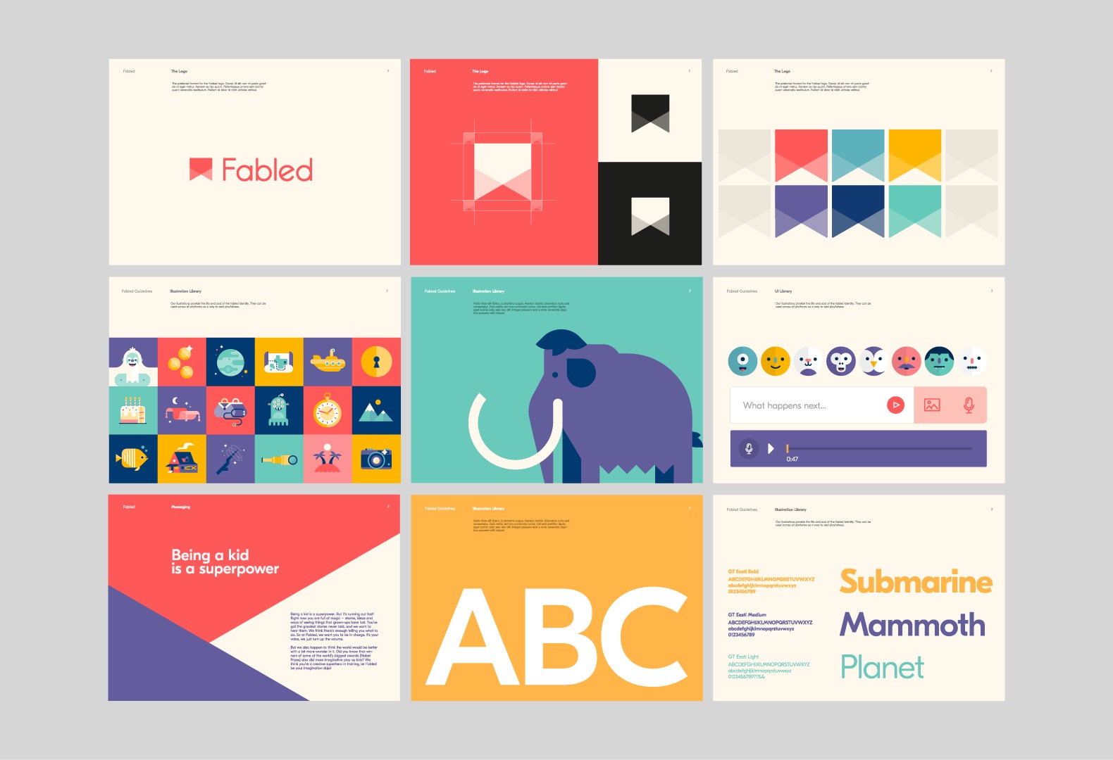
Emily says the best way to achieve this is getting yourself a set of Brand Guidelines and sticking to them. Brand Guidelines are information about your brand, i.e information about your logo/logos, font/fonts, colours, and colour codes. You can create this yourself or get a graphic designer to help you out. Here’s an example –
Another way of achieving Brand Awareness is staying active on social media, and keeping people interested in your brand or business. A great way of doing this is to think about promotions or campaigns, these can help you raise awareness about your business.
For example, asking people on social media to share your posts or tag their friends in your posts with the chance of being a winner in a giveaway of either a product or service your business offers. This will get your brand out there to people who may not have seen it otherwise, it’s a great way of marketing which is essentially free!
5. Context is everything
Emily tells us it’s important to note that graphic design gives context to things. You wouldn’t think of it unless someone pointed it out because we see messages in design subconsciously every day without thinking, but the way something is designed is always done for a reason. Your choice of font, or colour, or design will give context or a message of your business. Here is a simple example of how design gives context to things –

As you can see these two graphics have the same piece of paper, the same colour, and the same wording. The only thing that is different about them is the font, but this makes all the difference. Because of this font change, you get a completely different message when you look at both images.
The first one has a handwritten text font which gives a romantic feel and looks like a love letter, and the second looks like someone’s written the message in blood and gives a really creepy feeling. It’s such a simple thing, but that’s how easy it is to change a message or to change context in design. So try to remember that your branding should give some sort of context to your business.
So there you have it, the 5 things we learned from Emily Hicks’ Branding and Identity workshop!
If you would like to watch the whole workshop and get even more information, you can do so from our catch up library here 👇